Introduction
Chart.js is a popular open-source library for visualizing data. It allows you to create different types of charts from datasets such as bar charts, pie, line, donut, scatters, and many more.
In this tutorial, we are going to learn how to draw charts with Chart.js and how to customize them to suit our needs.
When you're done with the tutorial, you will learn how to create charts like the ones below:
Prerequisites
For you to understand this tutorial, you need to know the following:
- Basic understanding of Html and CSS
- Basic familiarity with JavaScript(OOP, Arrays)
Step 1 - Installation
Before we begin using Chart.js, we need to install it first. You can install Chart.js in a couple of ways.
- Approach 1: Using a CDN
This is the fastest and easiest way to include Chart.js in your project, and it is what we are going to use in this tutorial. Make sure you grab the latest CDN link from https://cdnjs.com/libraries/Chart.js. Copy the URL that has Chart.min.js at the end.
At the time of this writing, the latest version is 2.8, so I will use the following link in this tutorial:
https://cdnjs.cloudflare.com/ajax/libs/Chart.js/2.8.0/Chart.min.js
- Approach 2: Using NPM
You can also install Chart.js by using NPM
Copy and paste the command below to download it in your project:
npm install chart.js --save
- Approach 3: Download from Github
Another way to include Chart.Js is to download the latest version from Github.
You can follow the link to download it: https://github.com/chartjs/Chart.js/releases/latest
There are still other ways to install Chart.js, we not going to cover them all but you can visit this link to learn more about installing Chart.js.
Now that we have learned how to install Chart.js, let's add it to our project.
Step 2 - Setup Project with Chart.js
You can set up your project on Codepen or you can use a text editor like VSCode or Atom or anything you like.
We are going to create a basic index.html file and then load the CDN into the body section. We will also create the script.js file, which will later add the code to create the charts with Chart.js.
You can download the starter files to use them with the tutorial.
It contains only three files: index.html, main.css and script.js.
The script.js and main.css are empty, the index.html file contains the following code:
<!DOCTYPE html>
<html lang="en">
  <head>
    <meta charset="UTF-8" />
    <meta name="viewport" content="width=device-width, initial-scale=1.0" />
    <meta http-equiv="X-UA-Compatible" content="ie=edge" />
    <title>Chart.js tutorial</title>
    <link rel="stylesheet" href="main.css" />
  </head>
  <body>
    <script src="https://cdnjs.cloudflare.com/ajax/libs/Chart.js/2.8.0/Chart.min.js"></script>
    <script src="script.js"></script>
  </body>
</html>
Now that we have included Chart.js in our project, lets now proceed to create a place to render the charts first.
Step 3 - Create a Canvas to render the charts
Chart.js requires the presence of the Html5 Canvas tag which it uses to draw the charts. The canvas is used to draw lines, circles, etc. You can learn more about it here.
Create the canvas tag inside the body tag:
<canvas id="myChart" width="800" height="400"></canvas>
The ID is very important, and you can name it anything you like but it is recommended to use a descriptive name representing the kind of charts you want to render.
My body tag, now looks like this:
<body>
  <canvas id="myChart" width="800" height="400"></canvas>

  <script src="https://cdnjs.cloudflare.com/ajax/libs/Chart.js/2.8.0/Chart.min.js"></script>
  <script src="script.js"></script>
</body>
Step 3 - Prepare the data
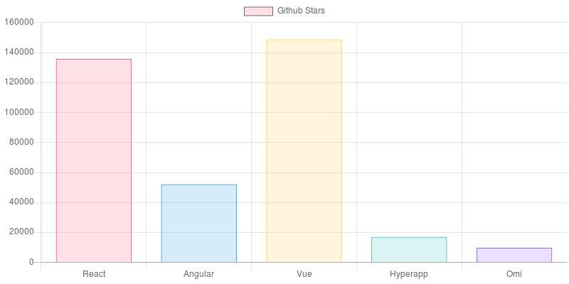
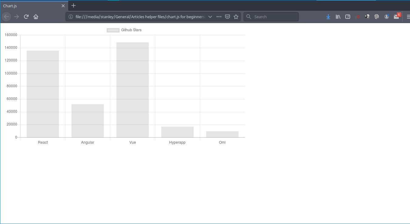
I currently have the following table which contains popular Javascript frameworks based on the number of stars they have on Github:
| Name of JavaScript Framework | Github Stars |
|---|---|
| React | 136,850 |
| Angular | 52,122 |
| Vue | 148,825 |
| Hyperapp | 16,939 |
| Omi | 9,763 |
We are going to represent the data in a bar chart. The x-axis(horizontal) will be used to plot the Javascript frameworks as labels while the y-axis(cross axis) will be used to plot the number of Github stars each framework has.
We need to store the data in arrays. We are going to store the names of the frameworks in a frameworks variable and store the Github stars in a stars variable.
So open the script.js file and type the following code:
var stars = [135850, 52122, 148825, 16939, 9763];
var frameworks = ["React", "Angular", "Vue", "Hyperapp", "Omi"];
As you can see, each framework in the frameworks variable corresponds with the number of Github stars it has on the stars variable. This is crucial to plotting accurate charts.
Step 4 - Create a bar Chart
Write the following code at the top of the script.js file:
var ctx = document.getElementById("myChart");
The code grabs the canvas element from html using the ID myChart and store it in a variable ctx.
You can name the variable anything you want,ctx is just a convection most programmers like to use, and it's what we will be using.
Now, let's create a chart. To create a chart, we first need to create an instance of the Chart().
To create an instance, you need to call the new Chart(), so type the following code:
var myChart = new Chart(ctx, {
  type: "bar",
  data: {},
});
The new Chart() object takes the following arguments:
ctxwhich is the variable used for storing the canvas element.- configuration object which allows you specify the chart type, data and chart options.
The configuration object looks like this:
{
 type: 'bar',
 data: {},
 options: {} // this is optional
}
The following is an explanation of the properties:
-
type: 'bar': allows you to specify the chart you want to create. In our case, we are creating a bar chart. If you wanted a pie, or line chart, you could specify it astype: 'pie'ortype: 'line'. -
data: It contains the data(labels, datasets) that will be used to plot the charts. Don't worry about this, we will get to it shortly. -
options: it contains configuration options to customize the charts such as changing the position of legend, enable/disable responsiveness, control styling, etc.
Our code does not render the charts yet, for us to render the charts, We need to pass our data(the ones we stored in the variables frameworks and stars) in the data object like this:
var myChart = new Chart(ctx, {
  type: "bar",
  data: {
    labels: frameworks,
    datasets: [
      {
        label: "Popular JavaScript Frameworks",
        data: stars,
      },
    ],
  },
});
By the way, here is how my whole script.js file is looking at this stage:
var ctx = document.getElementById("myChart");

var stars = [135850, 52122, 148825, 16939, 9763];
var frameworks = ["React", "Angular", "Vue", "Hyperapp", "Omi"];

var myChart = new Chart(ctx, {
  type: "bar",
  data: {
    labels: frameworks,
    datasets: [
      {
        label: "Github Stars",
        data: stars,
      },
    ],
  },
});
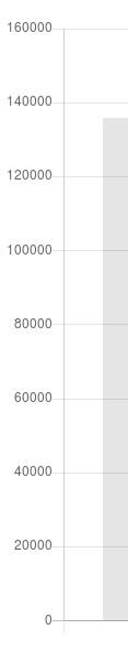
Open your index.html file with your favorite browser, and you should now see a beautiful bar chart.
You can checkout the codepen demo below:
<p class="codepen" data-height="265" data-theme-id="0" data-default-tab="html,result" data-user="Stanleyu" data-slug-hash="xxxKbMQ" style="height: 265px; box-sizing: border-box; display: flex; align-items: center; justify-content: center; border: 2px solid; margin: 1em 0; padding: 1em;" data-pen-title="bar chart"> <span>See the Pen <a href="https://codepen.io/Stanleyu/pen/xxxKbMQ"> bar chart</a> by Stanley Ulili (<a href="https://codepen.io/Stanleyu">@Stanleyu</a>) on <a href="https://codepen.io">CodePen</a>.</span> </p> <script async src="https://static.codepen.io/embed/ei.js"></script>
Understanding the Data Property
Let me now explain what happened here:
 data: {
    labels: frameworks,
    datasets: [{
        label: 'Github Stars',
        data: stars
    }]
 },
The data property object has two properties labels and datasets.
The labels takes an array(frameworks) and displays every element as a label on the x-axis.

The datasets takes an array of objects which has the following properties:
- label
- data
label property, takes a string. It is usually displayed on top of the chart or when hovering the bars.
data takes an array of values(Github stars) and displays the data on the y-axis(vertically).
Step 5 - Control Chart.js width and height
Before we proceed to style the bars, there is an issue we need to fix. This will apply mostly to those who are testing the code in the browser to see their charts.
You might notice that the browser is displaying the chart full screen, and it is not respecting the width and height we set on the canvas element previously.
<canvas id="myChart" width="800" height="400"></canvas>
to fix this we will need to add configurations to our bar chart instance by passing it an options object and then set maintainAspectRation to false.
var myChart = new Chart(ctx, {
    type: 'bar',
    data: {
    ......
    },
    options: {
        maintainAspectRatio: false
    }
})
If you try it again in the browser, you will see that the bar chart is 400 pixels tall(height) but the width is being ignored.
To completely gain control of the width, we need to set responsive to false.
 .........
 options: {
    maintainAspectRatio: false,
    responsive: false
 }
If you run the browser now, you will see that the width is 800px and the height is 400px.
You can also check out a working Codepen here: https://codepen.io/pen/
Another option to controlling the width and height of your chart is by using css. But this option requires extra markup in HTML, but it is flexible as our chart will have controlled width and height, and it will still be responsive.
First off, you have to remove the options object:
 ....
 // remove the following code
 options: {
    maintainAspectRatio: false,
    responsive: false
 }
Now, let's edit the index.html file and put our canvas tag inside a div element.
<div class="wrapper">
  <canvas id="myChart"></canvas>
</div>
I have removed the width and height since we don't need them anymore.
Let us now open the main.css and type following code:
.wrapper {
  max-width: 800px;
  margin: 0 auto;
}
Now, open your index.html file in your favorite browser and you will see it has a maximum width of 800px, and it is also responsive.
You can also check out the pen here: https://codepen.io/Stanleyu/pen/ZEEzNmm
Now that we have gotten this out the way, let us now proceed to style the charts.
Note: In the next steps, the charts will be full screen because I want them to display properly when embedded on this page. {: .notice--info}
Step 6 - Style the Chart
Let us now make our bar chart pleasing to the eye by styling it. The default styles are too boring for my taste.
Let's style the bar chart to make it look more appealing.
We will use the following properties:
backgroundColor- Takes an array of Hexadecimal or RGBA color values(strings) which will be used to color the bars in the chart.borderColor- It takes an array of color values strings, the same as the backgroundColor property. It will color the borders of the bars.borderWidth- It takes an Integer or a float value and it specifies how wide a border should be.
To understand the properties clearly, we will add them one by one so that you understand how and when to use them.
backgroundColor
Let us now color our bars by adding the backgroundColor with an array containing RGBA color values into the object in datasets property:
 ....
 data: stars,
 backgroundColor: [
 "rgba(255, 99, 132, 0.2)",
 "rgba(54, 162, 235, 0.2)",
 "rgba(255, 206, 86, 0.2)",
 "rgba(75, 192, 192, 0.2)",
 "rgba(153, 102, 255, 0.2)"
 ]
 ....
info: I have taken the color values from the Chart.js documentation. {: .notice--info}
You can see the working demo in the codepen:
<p class="codepen" data-height="265" data-theme-id="0" data-default-tab="js,result" data-user="Stanleyu" data-slug-hash="XWWrbNo" style="height: 265px; box-sizing: border-box; display: flex; align-items: center; justify-content: center; border: 2px solid; margin: 1em 0; padding: 1em;" data-pen-title="bar chart - styled"> <span>See the Pen <a href="https://codepen.io/Stanleyu/pen/XWWrbNo"> bar chart - styled</a> by Stanley Ulili (<a href="https://codepen.io/Stanleyu">@Stanleyu</a>) on <a href="https://codepen.io">CodePen</a>.</span> </p> <script async src="https://static.codepen.io/embed/ei.js"></script>
Our bar chart is looking good, but we can do better, let us add borders to make it pop.
borderColor
To create borders for our bar chart, we will be using the borderColor property by passing it an array of 5 RGBA color values. We add it after the backgroundColor property.
For the borderColor property to work. You must also put add the borderWidth, otherwise, you won't see any borders.
 ....
 borderColor: [
 "rgba(255, 99, 132, 1)",
 "rgba(54, 162, 235, 1)",
 "rgba(255, 206, 86, 1)",
 "rgba(75, 192, 192, 1)",
 "rgba(153, 102, 255, 1)",
 ],
 borderWidth: 1
 ....
You should now see a beautiful bar chart with borders
<p class="codepen" data-height="265" data-theme-id="0" data-default-tab="js,result" data-user="Stanleyu" data-slug-hash="MWWWWxY" style="height: 265px; box-sizing: border-box; display: flex; align-items: center; justify-content: center; border: 2px solid; margin: 1em 0; padding: 1em;" data-pen-title="bar chart with borders"> <span>See the Pen <a href="https://codepen.io/Stanleyu/pen/MWWWWxY"> bar chart with borders</a> by Stanley Ulili (<a href="https://codepen.io/Stanleyu">@Stanleyu</a>) on <a href="https://codepen.io">CodePen</a>.</span> </p> <script async src="https://static.codepen.io/embed/ei.js"></script>
Now we have successfully created our bar chart, let's turn into a pie chart in the next step.
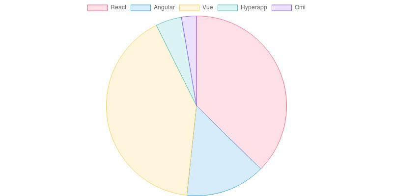
Step 7 - Create a Pie Chart
Creating a pie chart is very simple, all we need to do is to change the type from type: "bar" to type: "pie":
var myChart = new Chart(ctx, {
 type: "pie",
 ....
Check out the Codepen below and see our beautiful pie chart.
<p class="codepen" data-height="265" data-theme-id="0" data-default-tab="js,result" data-user="Stanleyu" data-slug-hash="mddddYK" style="height: 265px; box-sizing: border-box; display: flex; align-items: center; justify-content: center; border: 2px solid; margin: 1em 0; padding: 1em;" data-pen-title="pie chart"> <span>See the Pen <a href="https://codepen.io/Stanleyu/pen/mddddYK"> pie chart</a> by Stanley Ulili (<a href="https://codepen.io/Stanleyu">@Stanleyu</a>) on <a href="https://codepen.io">CodePen</a>.</span> </p> <script async src="https://static.codepen.io/embed/ei.js"></script>
Hover on the pie sections to see the label and the values.
As you can see, most properties that we used to create the bar chart, also works with creating a pie chart.
In the next step, we will turn our pie chart into a line chart.
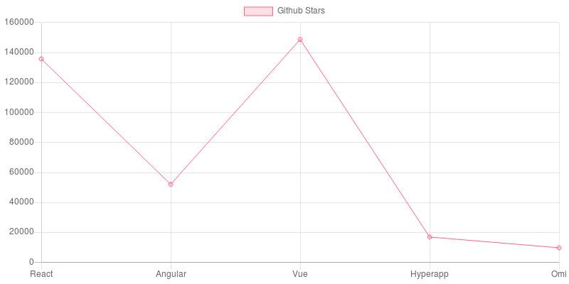
Step 8 - Create a Line Chart
Turning a chart from a pie chart or a bar chart into a line chart is not very hard.
There are only a few things we need to be aware of to successfully do it:
backgroundColoris used to color the line points. We will just pass one color value, instead of passing on an array of values to style the points because we want the points to have the same color.borderColoris used to color the line.
...
var myChart = new Chart(ctx, {
 type: "line",
 data: {
    labels: frameworks,
    datasets: [
    {
        label: "Github Stars",
        data: stars,
        backgroundColor: "rgba(255, 99, 132, 0.2)",
        borderColor: "rgba(255, 99, 132, 1)",
        borderWidth: 1
    }
    ]
 }
});
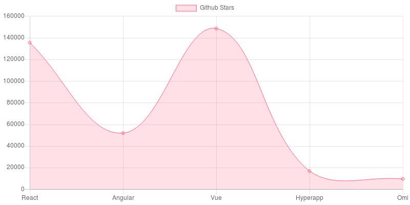
Here is how our line chart looks:
You can checkout the pen below:
<p class="codepen" data-height="265" data-theme-id="0" data-default-tab="html,result" data-user="Stanleyu" data-slug-hash="JjjjoPJ" style="height: 265px; box-sizing: border-box; display: flex; align-items: center; justify-content: center; border: 2px solid; margin: 1em 0; padding: 1em;" data-pen-title="JjjjoPJ"> <span>See the Pen <a href="https://codepen.io/Stanleyu/pen/JjjjoPJ"> JjjjoPJ</a> by Stanley Ulili (<a href="https://codepen.io/Stanleyu">@Stanleyu</a>) on <a href="https://codepen.io">CodePen</a>.</span> </p> <script async src="https://static.codepen.io/embed/ei.js"></script>
While the line chart looks good, I believe there are a few things we can change, we will remove the fill underneath the line and reduce the line curvature.
To achieve that, we will use the following properties:
-
fillis used to specify whether the area underneath the line should be filled. If the property is not included, the line will have a fill by default. To remove the filling, you usefill: falseproperty. -
lineIntensityis used to increase or decrease the line curvature, to remove the line curvature, setlineintensityto zero.
Type the following code after the borderWidth property:
...
 fill: false,
 lineTension: 0
...
<p class="codepen" data-height="265" data-theme-id="0" data-default-tab="js,result" data-user="Stanleyu" data-slug-hash="qBBBERp" style="height: 265px; box-sizing: border-box; display: flex; align-items: center; justify-content: center; border: 2px solid; margin: 1em 0; padding: 1em;" data-pen-title="line chart no fill"> <span>See the Pen <a href="https://codepen.io/Stanleyu/pen/qBBBERp"> line chart no fill</a> by Stanley Ulili (<a href="https://codepen.io/Stanleyu">@Stanleyu</a>) on <a href="https://codepen.io">CodePen</a>.</span> </p> <script async src="https://static.codepen.io/embed/ei.js"></script>
Conclusion
In this article, you learned how to create bar charts, pie and line charts.
Chart.js can do so much more and we have only scratched the surface. You can continue learning more about Chart.js by checking out their documentation.
Additional Resources
https://www.chartjs.org/docs/latest/
https://tobiasahlin.com/blog/introduction-to-chartjs/
https://www.codewall.co.uk/chartjs-tutorial-for-beginners-with-pdf-1/
https://www.createwithdata.com/getting-started-with-chartjs/